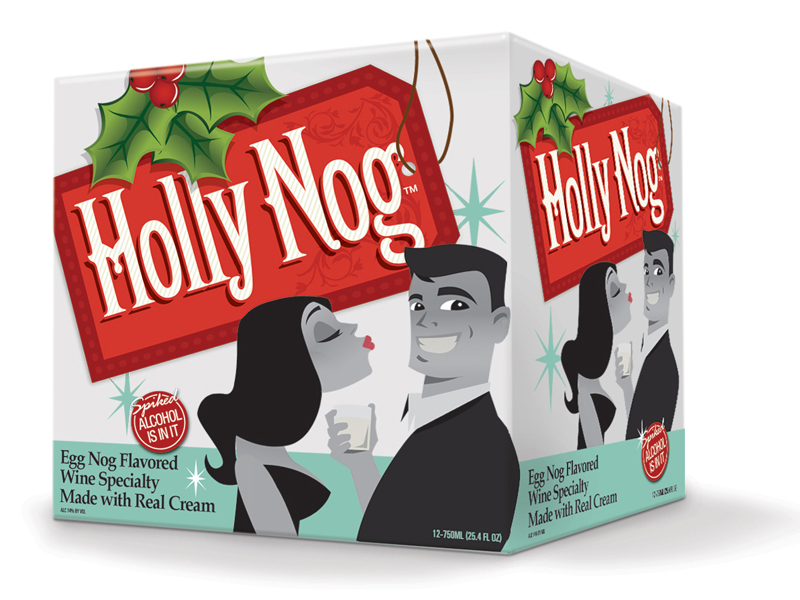
Packaging is what draws the consumer’s eye in-stores. This is your make or break moment in crowded aisles of competitors. Does your design have what it takes to get noticed?
When marketing a product, new or old, the packaging design needs to showcase the brand’s identity and establish a connection with consumers.
Some hot trends hitting packaging in 2016 thus far: geometric patterns, old- fashioned designs, and ASAP (as simple as possible). This year, packaging designs have stuck to the clean and simple look, making packaging more appealing to the eye and your guests’. Brands want consumers to display their product on their shelves instead of throwing it under the sink or in a drawer.
Here are a few things to keep in mind when coming up with your next killer packaging design.
Color. Stick to a color that will attract the consumer’s attention. While shopping, colors and images are what gather attention rather than words. For example, if your product is organic, browns and greens immediately give off an earthy vibe.
Words. Keep the number of words on the packaging to a minimum. Make the few words that you do choose for the design stand out. Bold, fancy, big words are more likely to grab a shopper’s attention in a cluttered aisle.
Shape. Think outside the box (literally) when designing the overall shape of the packaging. Many designers get stuck in a rut and follow the leader of what shape certain product’s packaging should be. Let your product stand out with a shape that is outside of the norm.
We know a thing or two about designing packaging that conveys a brand’s identity. Check out our work. Need help bringing your product to life? Give us a shout!
